CSA Design OS
An AI-native design workflow for a multi-brand assistant.
About the project
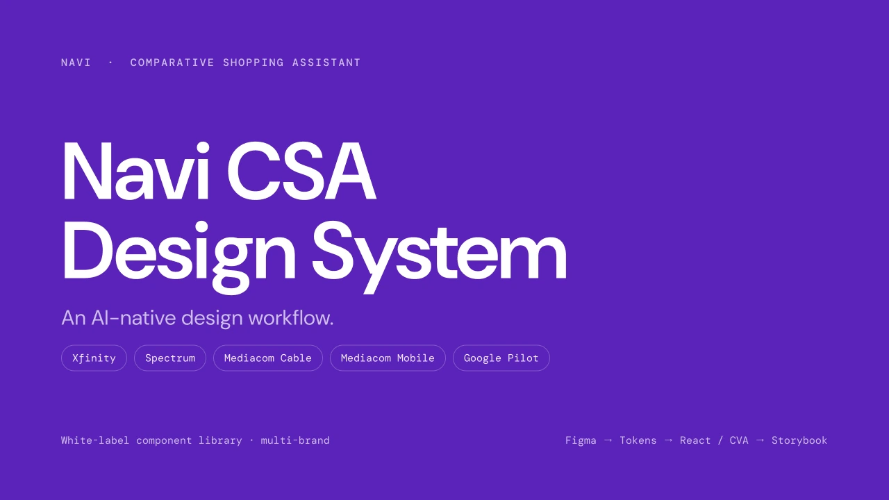
Navi's Comparative Shopping Assistant (CSA) runs under five brands at once: Xfinity, Spectrum, Mediacom Cable, Mediacom Mobile and Google Pilot. I designed and shipped its Design OS: one white-label system, from Figma to tokens to React and Storybook, that ships every output for every brand.
From the same components and tokens it ships runnable prototypes, the component library, the design docs, brand-aligned animation and ads, and the deck. Swap a brand and every output follows; the components never change.
- Company
- Navi
- Starting point
- A Figma design system and an Angular codebase
- Services
- Tokenized Figma design system, React component library, AI skills, design tokens mapped to the Angular codebase, Fidelity and Explore prototyping modes
- Year
- 2026
Outputs
6 things one system ships
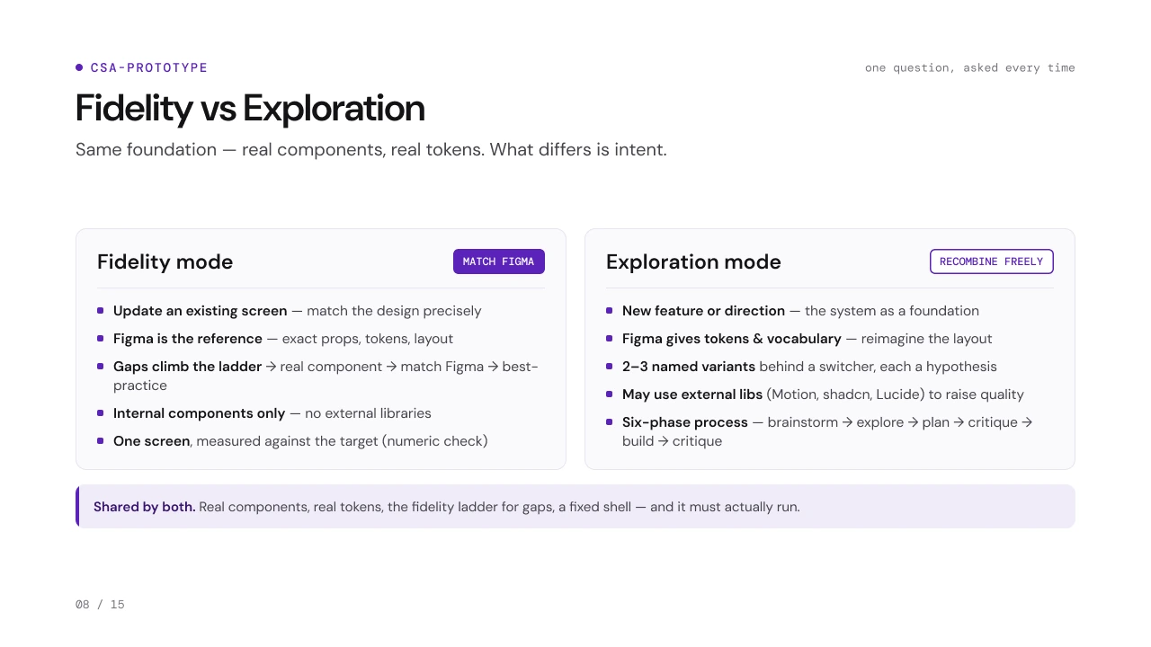
- Exploration mode · 3 variants
Recombine freely.
- New feature or directionthe system as a foundation
- Figma gives tokens and vocabularyreimagine the layout
- 2–3 named variantsbehind a switcher, each a hypothesis
- May use external librariesMotion, shadcn, Lucide, to raise quality
- Six-phase processbrainstorm, explore, plan, critique, build, critique
01Prototype
Runnable prototypes in both modes: a Fidelity-mode carrier comparison matched to Figma, and an Exploration-mode promo-ending screen with three variants behind a switcher.
- 02
Built-in Components
The white-label library in Storybook: docs, states, variants, brands and tokens for every component.
- 03
Design Docs
One searchable home for the system, for designers, PMs and engineers.
- 04
Brand-aligned Animation
Savings that count up and a comparison that slides in, with Framer Motion.
 05
05Brand-aligned Ads
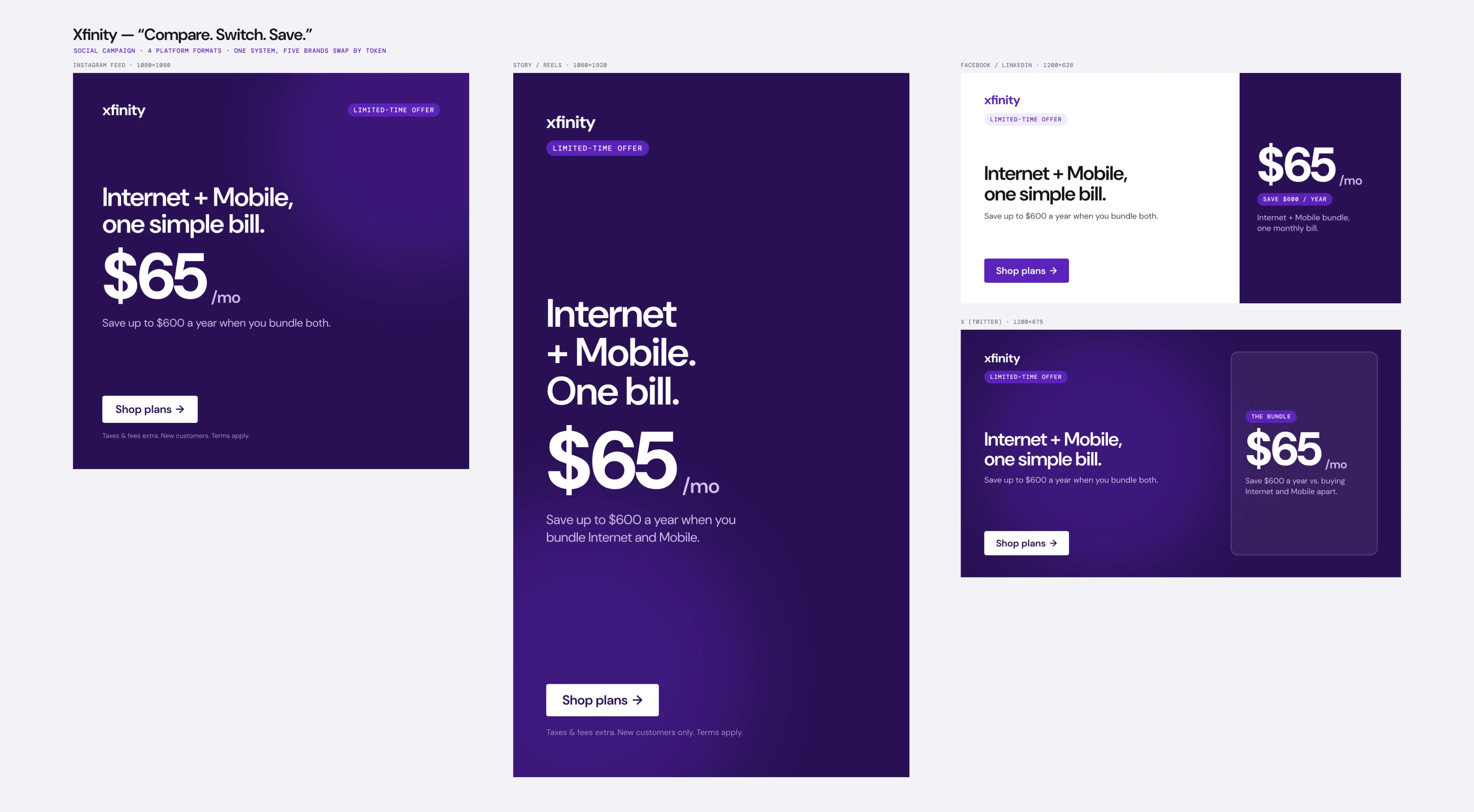
Xfinity, “Compare. Switch. Save.”: one campaign in four formats. Five brands swap by token.
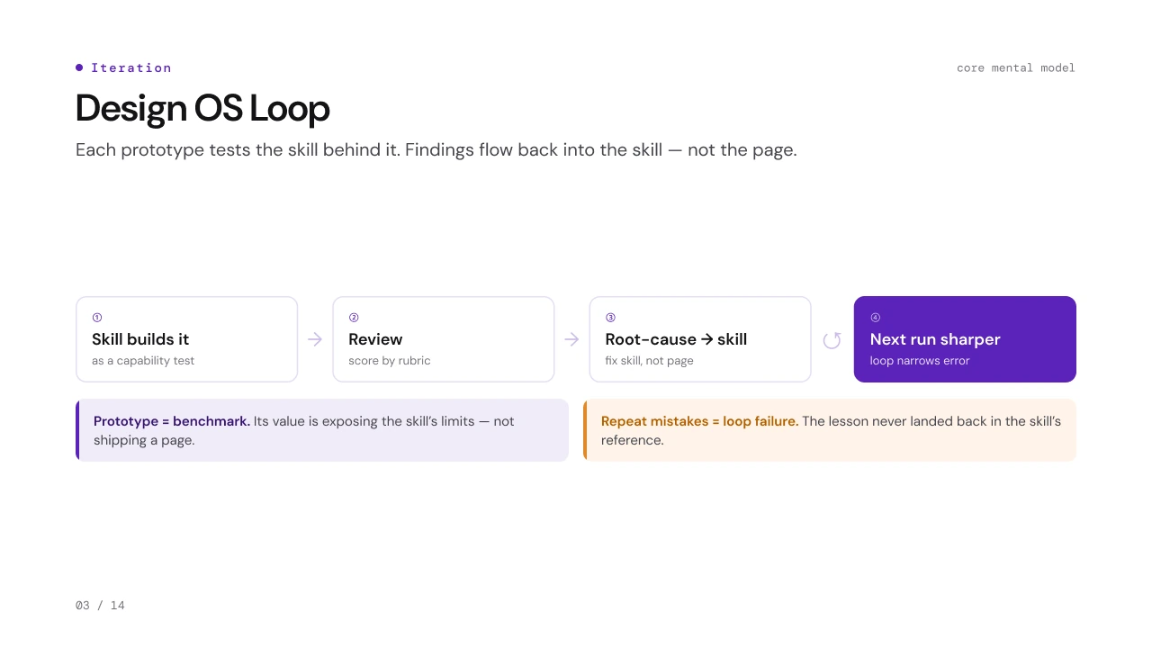
01 / 08Design OS Loop
06Slides
The deck that explains the system to the whole product team.
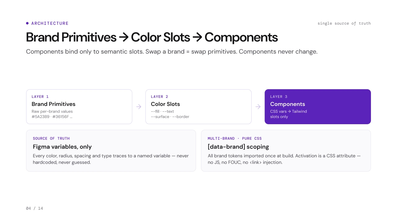
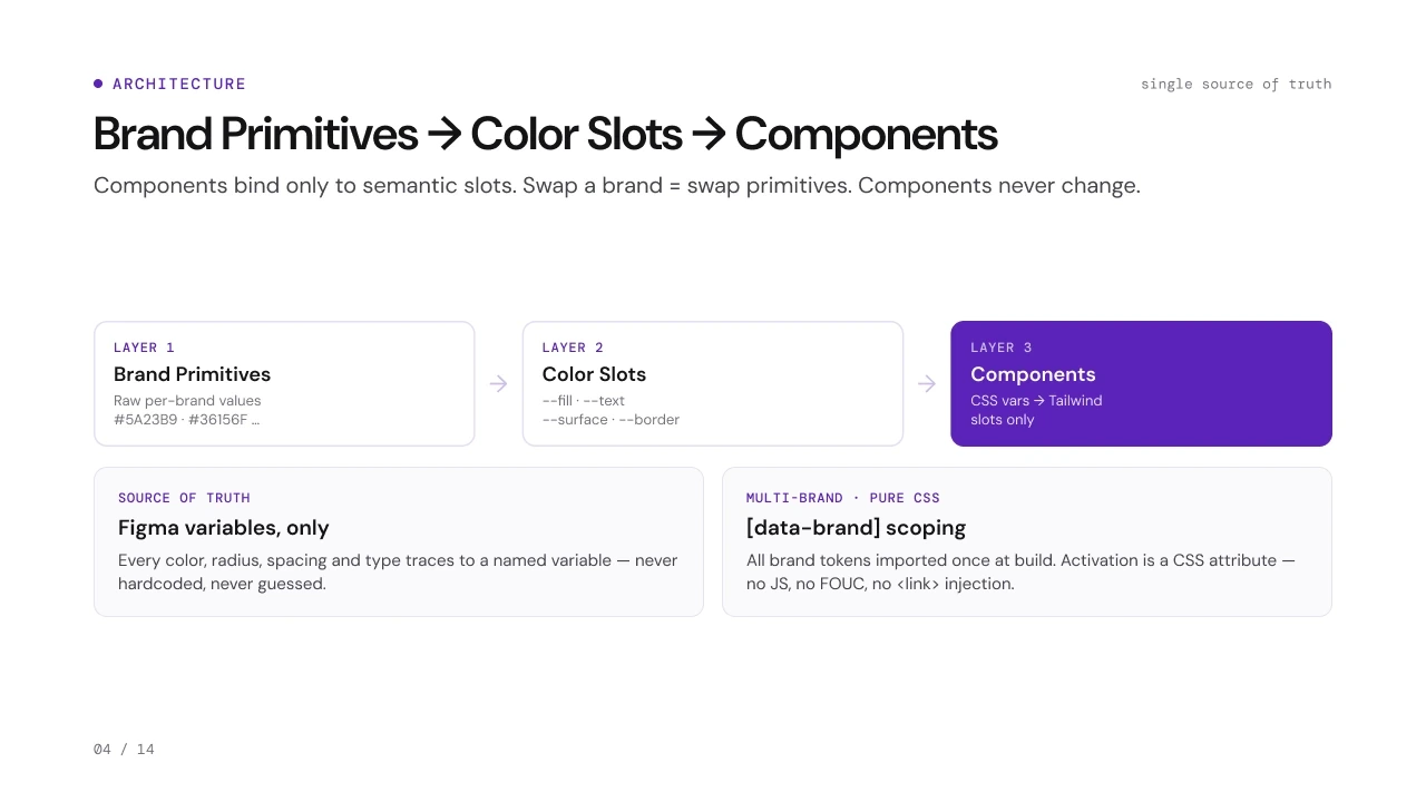
Brand Primitives Color Slots Components
Components bind only to semantic slots. Swap a brand, swap the primitives; the components never change.
Layer 1Brand primitives
--brand-500#5A23B9--brand-900#36156F--brand-200#D9CCF1--brand-50#F4EFFC
Layer 2Color slots
--fillbrand-500--textbrand-900--borderbrand-200--surfacebrand-50
Layer 3Components
Brand names from the deck; the colour values are illustrative.
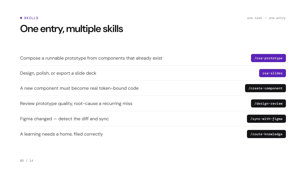
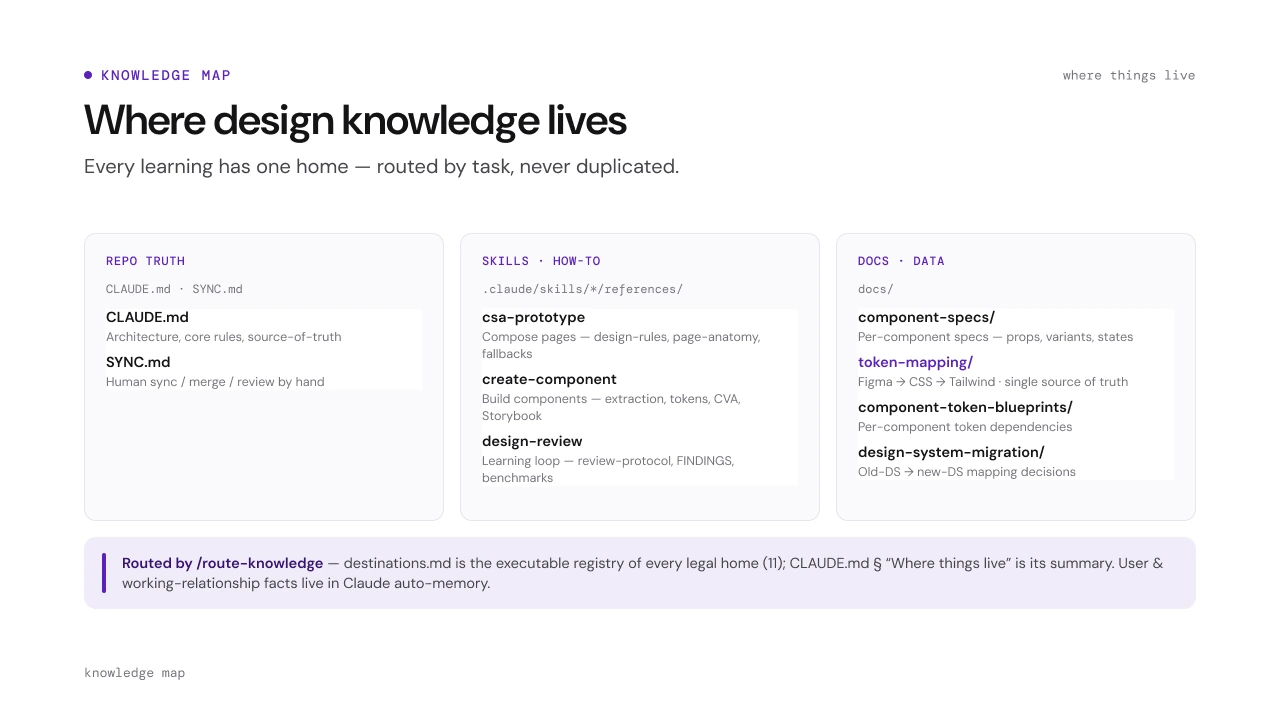
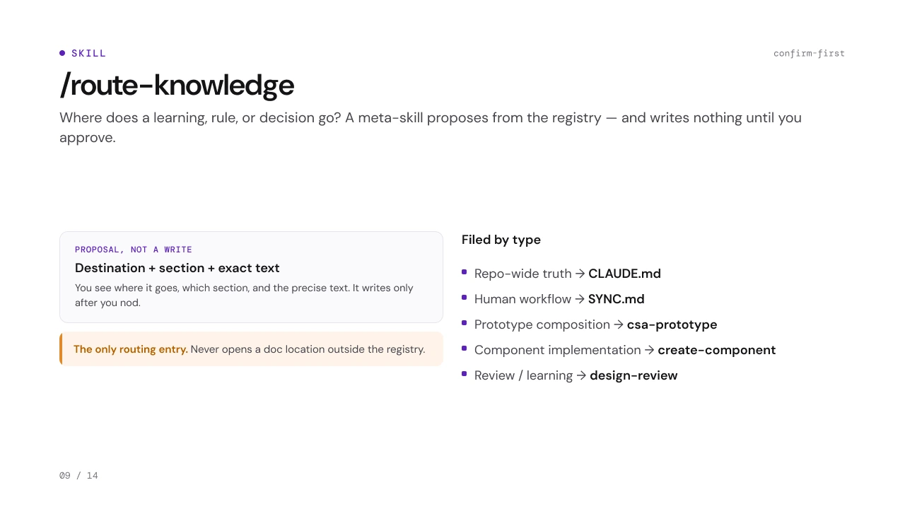
One entry, multiple skills
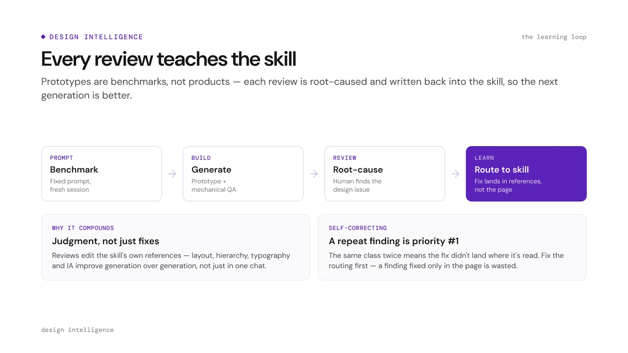
One task, one entry. Each skill carries the system's rules with it.
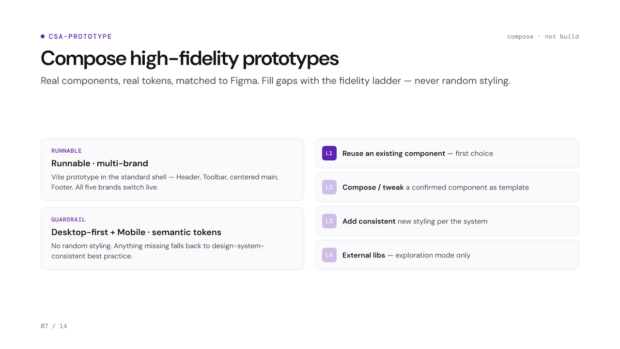
/csa-prototype
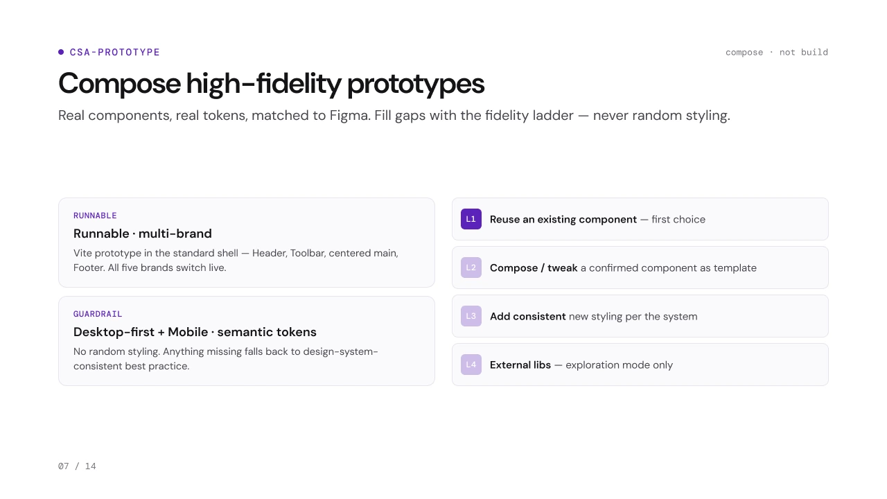
Real components, real tokens, matched to Figma. Gaps climb the fidelity ladder, never random styling.
L1Reuse an existing component, the first choiceL2Compose or tweak a confirmed component as a templateL3Add consistent new styling, per the systemL4External libraries, in exploration mode only